Monday, May 31, 2010

Inspired by: Unlikely pairs

This post is a journey... and a meandering one at that... I hope you'll bear with me! Here we go.

It started when I was driving to work a week or two ago and heard my local station's debut of the new Katy Perry song "California Gurlz." I thought I heard the DJ say that it was with Snoop Dog, but that made no sense to me, so I decided I needed to get my hearing checked and mentally moved on. Then, the boppy, cutesy song began and I thought to myself... "this is so Katy Perry" as I did the little car-dancing thing that you do when you are buckled-up for safety. About two thirds of the way through I hear a male voice begin to rap. Could it really be Snoop Dog? Huh? (By the way, when I started writing this blog, if you had told me that Snoop Dog would ever appear, I would have laughed you right out of town!). How on earth do Katy Perry and Snoop Dog even decide to work together? Who came up with that? And how on earth does it totally work?

In the meantime, I had been carrying around the New York Magazine Home Design issue in my purse for a week because I had intended to blog about the amazing Neo-Country piece that got my creative juices flowing. Not only was I in love with the clean, mid-Century Modern room that perfectly integrated hand-made wooden pieces that were rustic-inspired but with modern finishes, but the "Neo Classics" spread in which the classic shapes of farm tables and Baroque frames are made of unexpectedly modern materials such as glass and plastic had me itching to completed redecorate my house. NY Mag said it so perfectly... it is the "new old." And it works.


Rustic materials are the highlight of this room, which does not feel at all rustic.


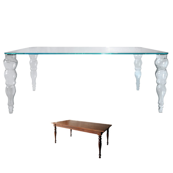
As much as I love the shape of the classic farm table, it would have no place with my more contemporary home aesthetic. The glass re-imagining of it is both modern and classic at once giving it new life.


Bright colors free these frames from their traditional roots while the shape pays homage to a classic style.

Why do these unlikely matches come together to create a whole that is superior to the sum of its parts? The best way I can explain it is to compare it to baking... have you ever wondered why recipes for cookies, cakes and pies call for at least one big, heaping teaspoon of salt? The salt brings out the sweetness in the other ingredients and heightens the strengths of their flavors.

It is easy to group things together which are the same - we are taught to do that basically from birth. And I distinctly remember learning what the word "clash" meant when a classmate teased another friend about wearing a pink shirt with red pants. But the thing is that when you limit yourself to only combining things that have elements of sameness or that organically "go together," you run out of options pretty quickly.

This applies not only to decor but to the other most important components of any event: music and food. A music trend that is beginning to run its course is classical string instruments playing contemporary music for a wedding ceremony... an unlikely match of modern melody and classic instrument makes an impact far greater than the music "expected" to emanate from a violin. And, if you watch Top Chef (or any cooking show) you know that you can't win unless you know how to put bacon in a dessert! Seriously. Bacon. In. Dessert.

The truth is that if you can finish the sentence without all of the words, the sentence doesn't even need to be said aloud. But, when the end of the story takes you to a place you never expected, you are riveted, and the story settles into your mind.

Why, oh, why have I told you all of this? Because I spend my days trying to create decor that sticks with you. More than just beautiful, I am after a look that is memorable. Does it always have to be accomplished with an unusual pairing? Certainly not. But it must be well-enough thought out that the choices appear to be conscious since I believe that something with that amount of power will find its way into the consciousness of another. Just like how Snoop meandered his way into my mind and into my blog.

Inspiration is everywhere.

Sunday, May 23, 2010

From the Vault: Adam's Bar Mitzvah


As I am putting the finishing touches on a Bar Mitzvah for next weekend, I was thinking about one of my very favorite Bar Mitzvah design projects from a number of years ago. Adam's celebration was at the legendary Tavern on the Green, which closed at the end of 2009, and while it was a phenomenal place for any celebration, it was not without it's share of serious design challenges... particularly when the Bar Mitzvah boy wants a Homer Simpson theme!


Whimsical escort table was placed outside the ballroom on the patio where cocktails took place. The colorful flower balls and wheatgrass hinted at the decor to come.

Tavern's decor was colorful and busy and just plain over the top - that's what made it famous. But, unless you intended to do something pretty simple there, it is quite a challenge to "blend," shall we say. In addition, most of the rooms had to be joined to one another, thus achieving an ideal layout was tricky. So, I had my work cut out for me. Not to mention... HOMER!!

If you've been reading for a while, you know how I feel about foam core centerpieces, so I wanted to come up with something that conveyed the theme clearly, but wasn't quite as overt as literally cutting Homer out of foam would be. I wanted it to be whimsical and fun, but still appropriate for adults since they made up more than half of the guest list. So, in one of my "wouldn't it be cool if..." rants, I thought it would definitely be cool to cut the characters out of colored acrylic. Their shapes are so recognizable that even without details it would be easy to identify the Simpson family and the acrylic would work with the best asset of the room - floor to ceiling windows - and allow light to pass through.


When I use so many bright colors, I like to do what I call "color blocking" so that tables are zoned mono-chromatically. This allows me to use a lot of color without making the room look too busy. For this party I used all of the graphic cartoon colors for the linens and the flowers and then kept the "Simpson Blue" reserved for the acrylic pieces.


The only place where foam core was a must was for the bar. We wanted to pay homage to Homer's favorite hang-out, so there was no way to go except to build a Moe's Tavern facade for Tavern's existing bar. Guests got drinks in glass beer mugs with a custom-made "Adam and Homer" logo (Adam's face was Simpson-ized!) and faux "Duff" cans were part of the display.


Because it is really not a party without a cool cake, the talented Cynthia Peithman of Cakeline designed this tiered confection featuring all of Homer's signature favorites... bowling balls, remote controls, Duff beer and, of course, donuts!


All photos by Lotus Photographers

Having never really been much of a Simpson's fan, I had to do some serious homework for this party... calls to old college friends and friends-of-friends helped quite a bit as did hours of tireless internet searches on everything Homer. You never know what sorts of interesting things you'll learn in this line of work...

Have a great week!

Monday, May 10, 2010

Drumroll please... Photo Shoot Challenge Winner!

First of all, I am so sorry for posting this several days late... there just have not been enough hours in the day to write this post! Bad, bad, bad....

But, in other news, we have a winner!

Congratulations to Ellie who submitted the best photo for the Photo Shoot Challenge! This photograph will be the inspiration for my upcoming photoshoot and Ellie will have the opportunity to participate as well as receive some great goodies from our sponsors. Ellie: we'll be in touch soon with deets... and thanks for the inspiration. I already have a ton ideas brewing so I can't wait to get started.

Thank you so much to all those who submitted fantastic interior photos. I am honored that you read and follow our work and I look forward to your continued participation in what I hope will become an even more interactive environment.

Here is what Ellie said about her favorite home interior that she found on HGTV: "I love the below design because it's romantic and soft. The curves on the bed frame and flowers on the wallpaper, the shabby chic nightstands make my heart melt. I also love the different shades of purple with subtle hints of green. This entire screams romantic, cheerful and somewhere I want to be." Ellie - you've got my number - I love this room too!


What do you think? Let me know if there are any elements from this room that you'd like to see in our photo shoot... maybe they'll appear!

Thursday, May 6, 2010

Sara and Scott: Dramatic and Classic New York City Wedding

I have been dying to post these amazing pictures from Sara and Scott's beautiful March wedding at Cipriani 42nd Street in New York City, but the time just kept getting away from me! Every one of the photos from superstar photographer Douglas Benedict was so gorgeous that it was hard to choose... I only hope that these selections can adequately convey the warm, glowing and romantic atmosphere in this landmark venue.

There was an exceptionally joyful vibe in the room that evening, which made producing this flawless wedding even more gratifying. Every once in a while I get a warm, fuzzy feeling from a wedding that I just can't shake, and on this cold and rainy night in Manhattan I was overwhelmed by it. My thanks to a beautiful couple and special family for inviting me to be a part of this day.

Enjoy!


This Oscar de la Renta dress is one of my favorites of all time. I love this moment in which Sara was nervously awaiting Scott's arrival.


This is a view of the ceremony in progress when standing at the entry. The chuppah was made entirely of cherry blossoms and created a cozy arch above the couple's heads. Unfortunately because Scott, his best man/brother and dad are all well over 6 feet tall, it was a bit of a squeeze in there!


A snapshot of the ballroom before guests entered for dinner. The centerpieces are made of yellow forsythia and purple vanda orchids with the tall pieces elevated on custom made acrylic stands. Hundreds of purple candles created an amazing glow in the room. Many thanks to my partners in crime.... and design... at City Blossoms for creating these magnificent arrangements.


Douglas Benedict works with light masterfully. I love how he captured the Old New York essence of the space in this shot.


Chocolate Blossom Cakes created this sweet and delicious masterpiece that coordinated perfectly with the decor. Inside, the cake included the couple's two favorite flavors - red velvet and carrot.


The escort table was transformed into the favor table at the end of the evening. My team created lovely favor boxes filled with French macarons - one in purple (violet flavored) and one in yellow (almond flavored) for a sweet finish.

Until next time,

My new gig on Examiner.com

If you don't catch my Twitter and Facebook feeds (gasp... you don't??), you may not know that in my oodles of spare time I have been indulging in one of my favorite pastimes and writing fun little articles for online newspaper Examiner.com. If you are already a wedding know-it-all some of the tips and trends may be old hat for you, but for those of you learning about the business or working on your wedding plans, I hope that some of my insights and reports will prove valuable.

As always, I treasure your feedback on the Examiner.com articles as well as anything you read on this blog, so don't be shy and drop me a note. If there are topics you'd like to see covered for the Examiner, I'd love to hear those too since developing engaging material is more than half the battle. Those of you who know me know that I can write or talk about just about anything...

You can catch up on what I've already published by checking out my Examiner.com homepage and you can visit regularly for more of the wedding banter I know you love.

Happy reading,

Tuesday, May 4, 2010

Photo Shoot Challenge Update: New Photography Sponsor!

I am so delighted to announce that our Photo Shoot Challenge tabletop will be photographed by talented New York City photographer Sofia Negron. Sofia has been shooting weddings and special events in Philadelphia and New York since 2002 and is sure to bring the look of the winning tabletop to new heights.

There are only four days left to enter your submission, so get to it! Vendors who want a spiffy ad like Sofia and Le'Penn Designs, you still have time too. Just send me an email at lindsay[at]lindsaylandmanevents[dot]com and we'll start our collaboration.

Can't wait to see more interior inspiration,

Monday, May 3, 2010

Design tidbit


I love when I find a little design tidbit in a surprising place. I was reading a restaurant review for a place not to far from my home (Uproot) and spotted this spectacular dining table. It is a classic American farmhouse style table and chairs, but they are painted in a high-gloss red, giving them a contemporary, updated feel. To top it off, literally, streamlined pendant lights hang from a funked-up lattice structure. Lattice and farmhouse - yes, a match. Pendant lights and high-gloss red - yes, a match. All together, who knew?

So, what does this all mean? To me, this means that the lines of design are constantly blurred. No longer does a specific piece of furniture box you in to a style, whether it is in your home or in your event venue. Opening your mind to the potential evolution of design may give you a world of possibilities far beyond what meets the eye. In all my years of doing events, I have never come across a venue contract that says "no slipcovering of our tattered entryway upholstered furniture that looks like it was from a yard sale in 1977." Or, for that matter, "no changing the lampshade on the dusty hallway fixtures." A small investment in the updating of an old or existing piece may set the style tone for your whole soiree.

Just don't bring in your high-gloss spray paint - this, I assure you, will not end well.

Happy designing,

Ps. After further research on this restaurant, I found this description of the decor:

"The space is au courant but not audacious... contemporary but exceedingly comfortable. It succeeds in gently caressing the eye rather than assaulting it."

It's funny because I was first captivated by the photo of that table, but these words so precisely describe what I work to achieve in my designs that I would be remiss for not sharing them. My website says "approachably modern" and this is just what I mean. Thanks, Art Nemendorf (The Artful Diner) at NJ.com. I guess I better go and eat at this place.

Photo courtesy of Park Place Magazine